Overview
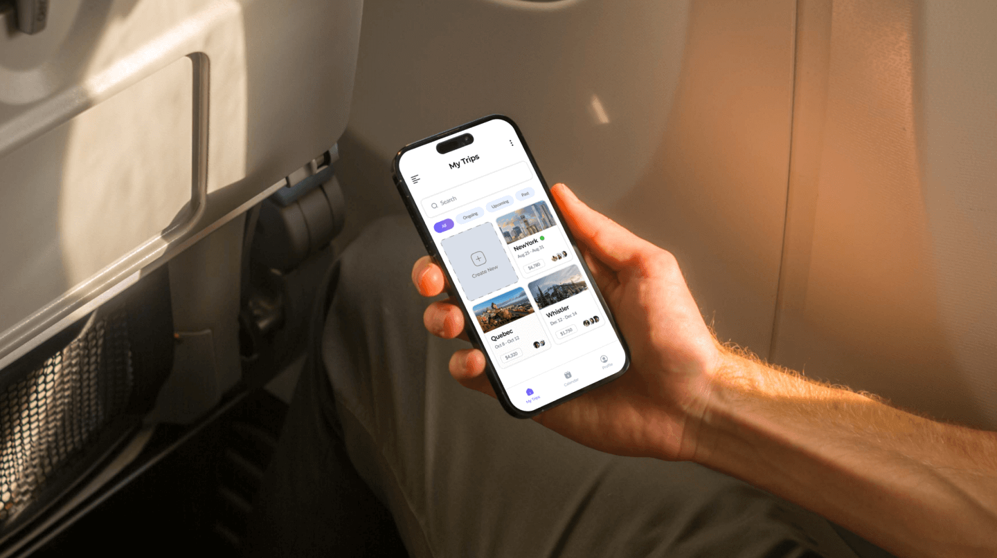
The Trip Planner app is a travel organization tool designed to simplify the travel planning process for users by managing all trip details, such as reservations and budget plans, itineraries, and packing lists. It provides real-time collaboration with travel mates for easy plan sharing and coordination, and offers a smooth and organized travel experience with a user-friendly interface and intuitive design.
-
Role
UI/UX Designer
-
Duration
3 Weeks
-
Tools
Figma
Project Goal
Creating a travel organization mobile application that allows users to collaborate with their travel mates easily and intuitively
Analyze
Defining
Target Audience
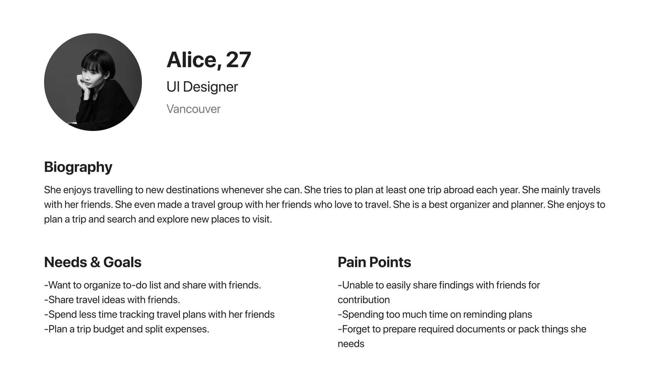
By defining a potential target audience for the Trip Planner app and creating user personas with their goals and needs, I was able to determine the main features and design decisions for the app. Understanding the needs of our users allowed us to create an app that is tailored to their specific requirements, ensuring a user-friendly and intuitive experience.
User Persona
Ideation
Design Process
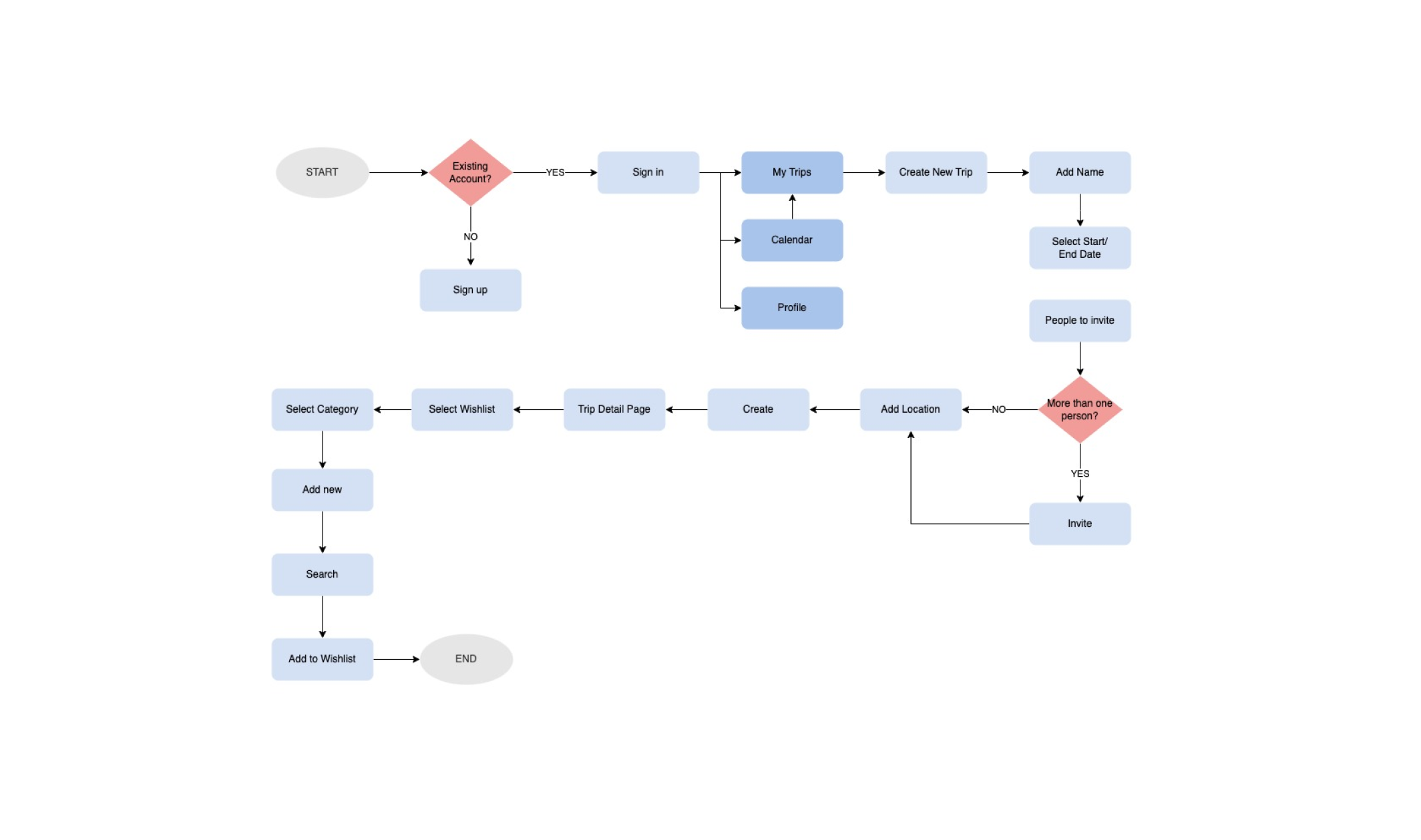
I created a user flow to understand how users interact with the app. User flow is mainly focused on the creating Wishlist process. User flow takes users from their entry point through a set of steps such as creating a new trip and adding Wishlist items toward a successful outcome and final action.
User Flow
Wireframe
Design
Design System
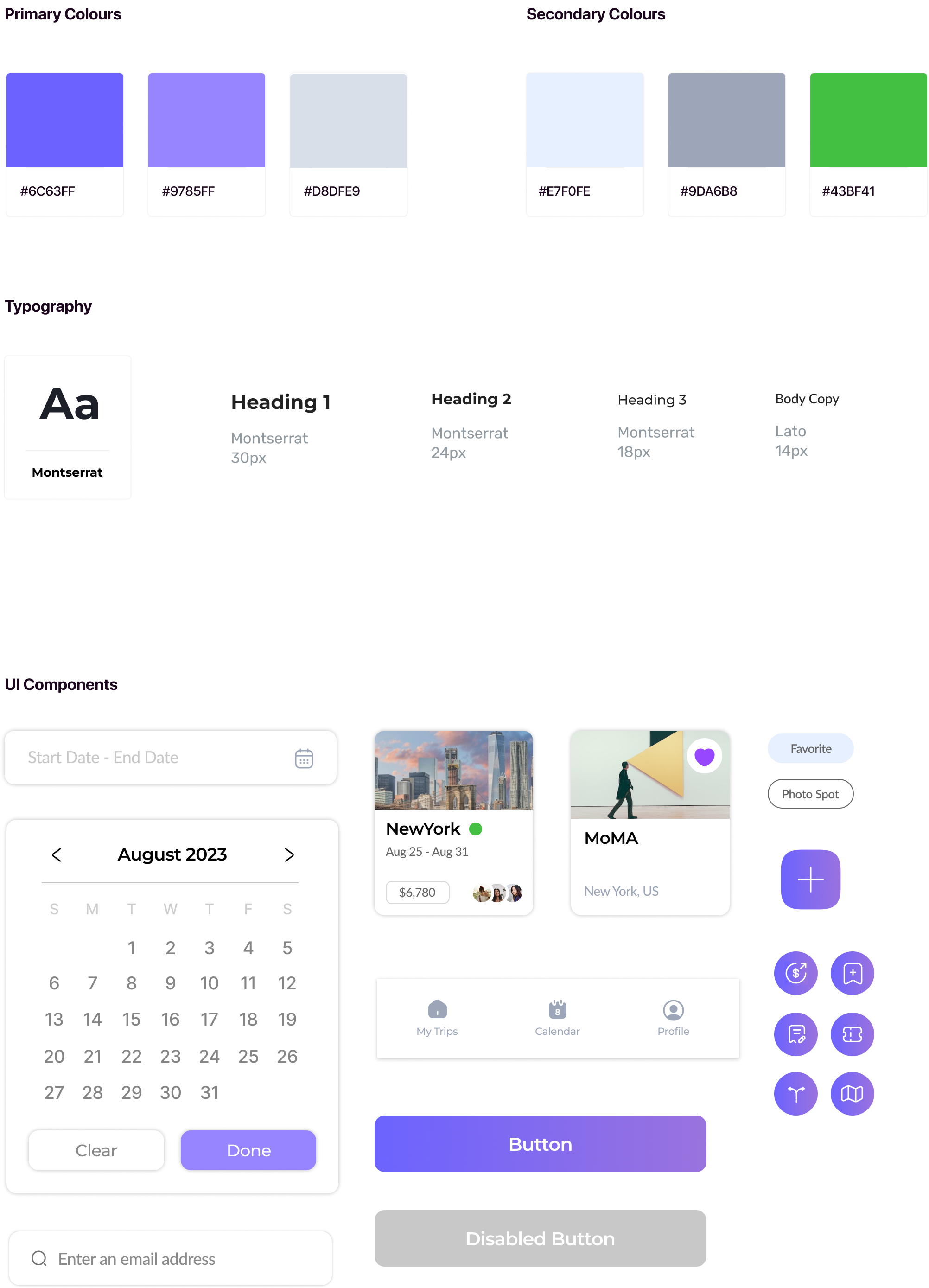
I was inspired by a clean and minimalistic design with a friendly typeface. I decided to use a bluish-purple colour scheme as a main theme colour.
Validate
User Testing
I used the Maze user testing platform to conduct unmoderated user testing to test out my interactive prototype. My goal of this user testing was to test if users were able to create a custom trip page and add their plans easily.
Finding 1
When adding an item to Wishlist, people tend to click the photo or text area to add an item, even though there is an add button icon.
Finding 2
2 testers mentioned that there are too many actions require to reach the end-goal when they are creating a trip page.
Finding 3
High misclick rates occured during the task 2.
Iteration
Based on the user feedbacks and my observations. I made iteration to user interface to improve the overall user-experience of an app.
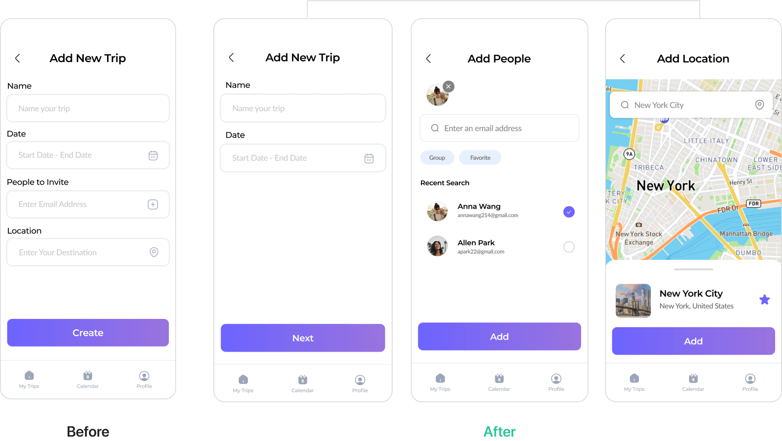
1.Break down the task into smaller steps.
I created additional pages rather than showing all of the tasks on one page so that users can focus on one task at a time.
2. Change the UI of Add Wishlist Page.
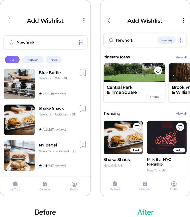
I created a card UI for Wishlist items and make it horizontally scrollable to show more items to browse. I also changed the icon to heart icon to make it more intuitive.
3. Reduce the size of Button.
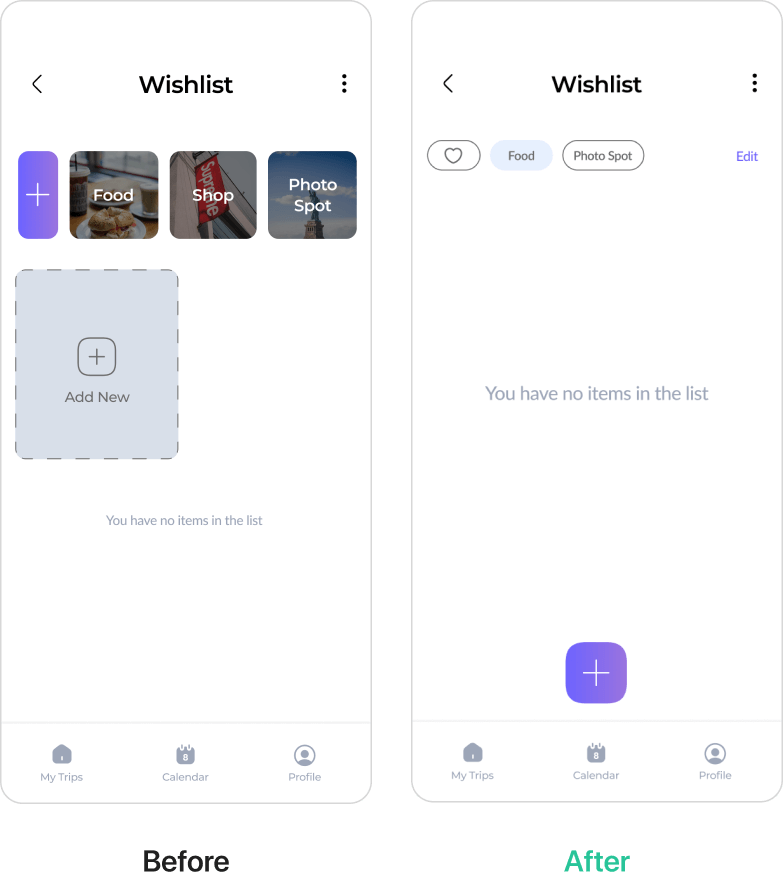
Categories and Add New button take up much spaces and distract users from completing the main goals. I reduce the size of categories and placed the add button at the bottom to make it easier for users to tap.
FINAL DESIGN
Hi-Fidelity
Prototype
With the result of the user testing and the style guide, I finalized high-fidelity prototype. The final prototype shows a complete idea of how the Trip Planner app will look like in the final result.

Reflection
What I Learned
Takeaway 1
I learned that assumptions can be dangerous in the design process, as they can lead to design decisions that don't align with the actual user needs. Without user research, I had to make assumptions about the users, which could have impacted the final design. In the future, I plan to ensure that user research is incorporated into the design process to avoid making assumptions and create a more effective and user-centered design.
Takeaway 2
I learned the importance of avoiding overwhelming users with too many tasks on a single screen. I discovered that reducing the number of steps or breaking them down into smaller tasks can help users feel like they're able to achieve their goals.

