Overview
My goal of this project was to enhance the transit experience for users in Metro Vancouver by creating a Compass Card app. Currently there is no smartphone app available for Compass Cards, and this project is aim to address that issue, offering more user-friendly and accessible solution for those who use public transit in Metro Vancouver.
-
Role
UI/UX Designer,
Visual Designer
-
Duration
3 Weeks
-
Tool
Figma
PROBLEM
Transit users in Vancouver are currently experiencing inconvenience and frustration due to the lack of a Compass Card mobile app.
Solution
Solution 1
Tap Pay
Quickly and easily pay for your transit fare by simply tapping your Compass Card on your smartphone.
Solution 2
Load Card
Reload your Compass Card with funds from your bank account or credit/debit card, making it easy to keep your card topped up and ready to use.
01 RESEARCH
User Research
& Insights
The online user survey was conducted among transit users in Metro Vancouver to find out the inconveniences of using the physical Compass Card. Of the participants, 85.7% were in the age group of 15-30. This user survey helped me uncover the pain points and needs of Compass Card users.
01
90% of users answered that carrying the physical Compass Card and constantly taking it in and out of their wallet is their biggest frustration.
02
81% of users preferred loading their Compass cards online rather than using vending machines.
03
Users have to manually visit the transit web browser or use other transit resources to plan their route.
02 ANAYLZE
Defining
Target Audience
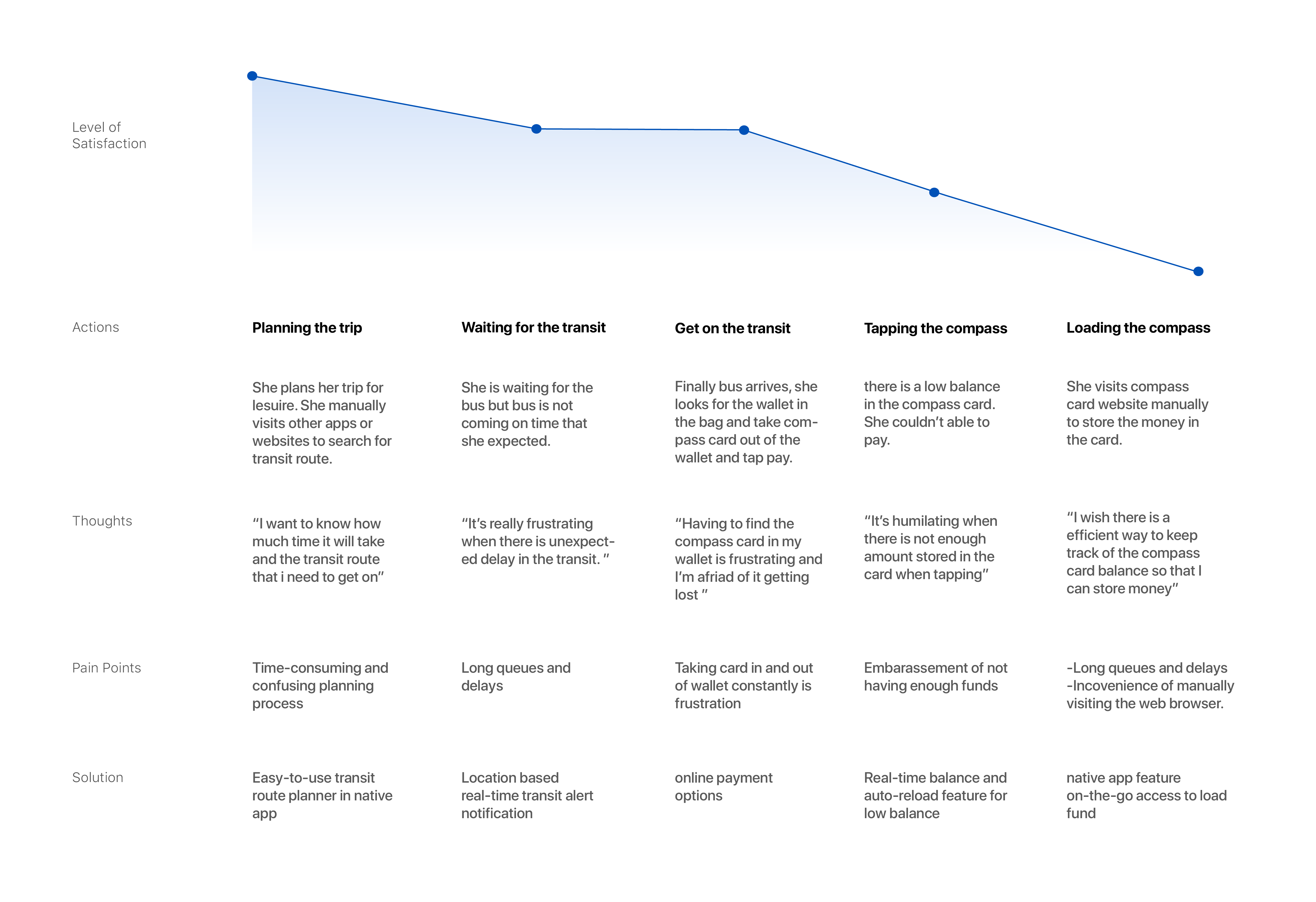
I defined a brief target user group and identified their pain points and needs based on my research. Using a user journey map, I was able to pinpoint the pain points users experienced when using a compass card and the transit system. This allowed me to develop a solution that addressed their needs.

JASMINE, 30
Office Worker
I am commuting every weekday to go to my work. I am constantly frustrated by the inconvenience of using a physical Compass Card. It's frustrating to have to keep track of my balance manually, and I often find myself running out of funds at the worst possible time.

JASON, 23
University Student
I've been using the U-Pass since I started school, but requesting it manually through the web browser is a hassle. I often forget to request it on time and end up paying for transportation out of pocket, which is a financial burden.
User Journey Map
03 IDEATION
Design Process
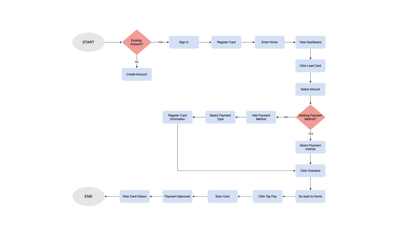
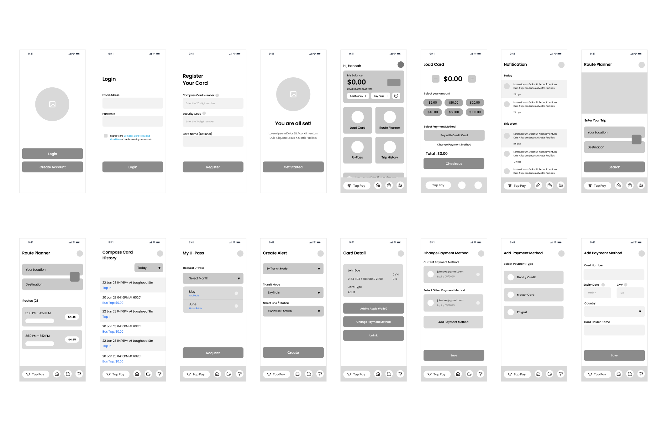
To better understand how users interact with the app, I created a user flow. The flow focused on how users load their compass card and make payments through the app. By using the insights gained from the user journey map and user flow, I was able to create wireframes that included features designed to help users achieve their goals.
User Flow
Wireframe
04 DESIGN
Design System
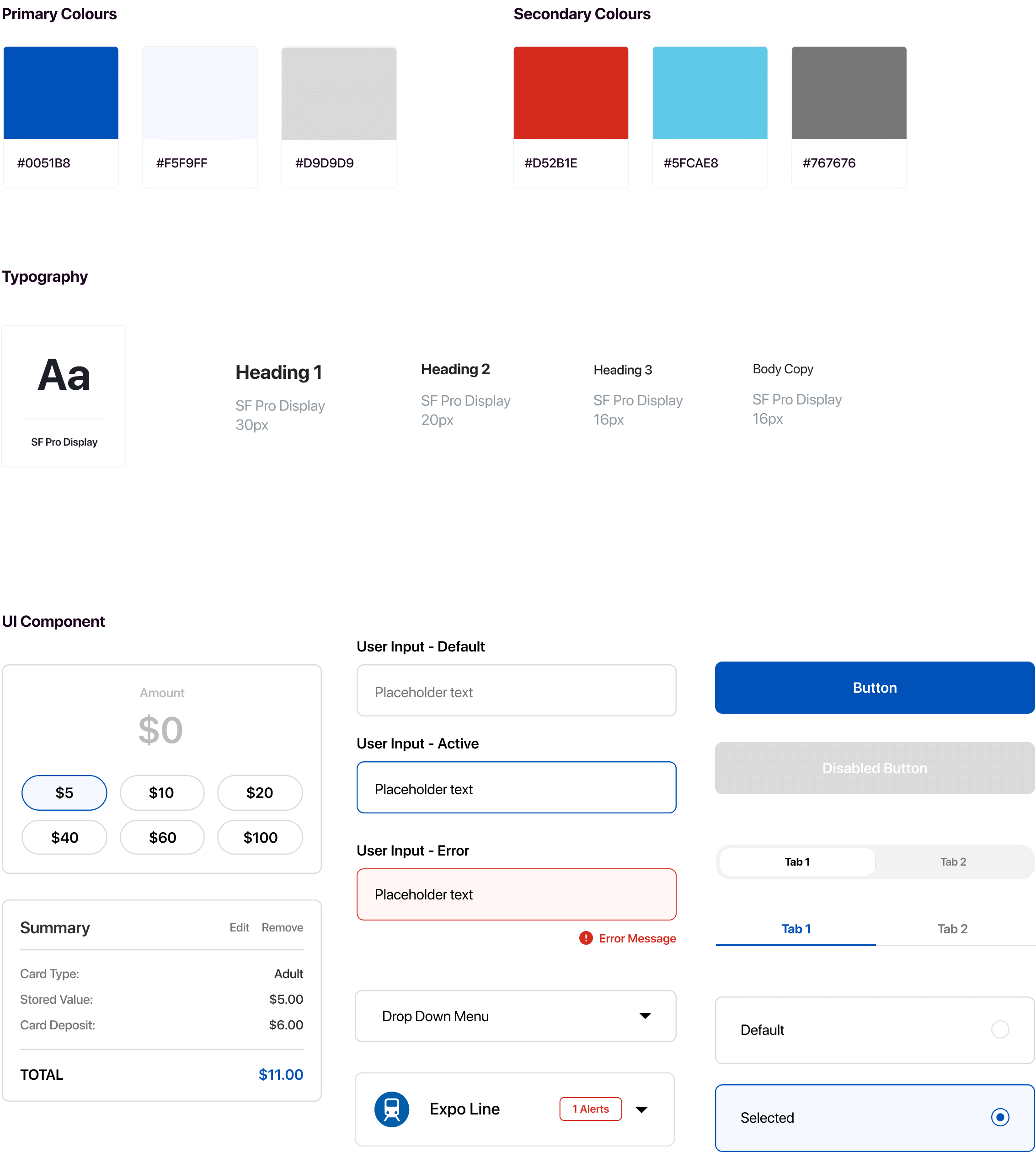
The overall design concept is minimal so that users can use the app without any visual distractions and can focus on the functionality in the app. I mainly used the TransLink’s colour scheme and its font-family for consistency in brand identity.
05 VALIDATE
User Testing
I conducted unmoderated user testing with the app’s target users to uncover the issues that hinder users from achieving their goals. The overall user feedback was that they did not find any difficulty while completing the tasks.
Finding 1
The user feedback suggests that the placement of the "load money" category in the Home screen feels awkward and out of place because it is separared from the primary card section.
Finding 2
The feedback indicates that there should be a visual indicator or "Back" button available on the Register Your Card screen during the onboarding process.
Finding 3
The user feedback suggests that the default payment method should be visually indicated with a check mark.
Iteration
Based on the user feedback and my observations, I made iterations to the user interface to improve the overall user experience of the app.
1. Created process indicator
I included a process indicator of the onboarding process to help users easily understand where they are in the onboarding process and how many steps are remaining.
.png)
2. Rearranged the category
I thought it would be beneficial to integrate the "Load Money" category seamlessly into the primary card section to help users easily identify and access the category without any confusion.
.png)
3. Added check mark on the default payment
By adding a check mark, which is a clear visual cue to users, users can easily identify the default payment method and have confidence in their selection during transaction.
.png)
4. Revised U-Pass screen
I have revised the UI of the U-Pass request screen to provide an intuitive and user-friendly experience. The previous table format was not effective or intuitive for users.
.png)
06 FINAL DESIGN
Hi-Fidelity
Prototype
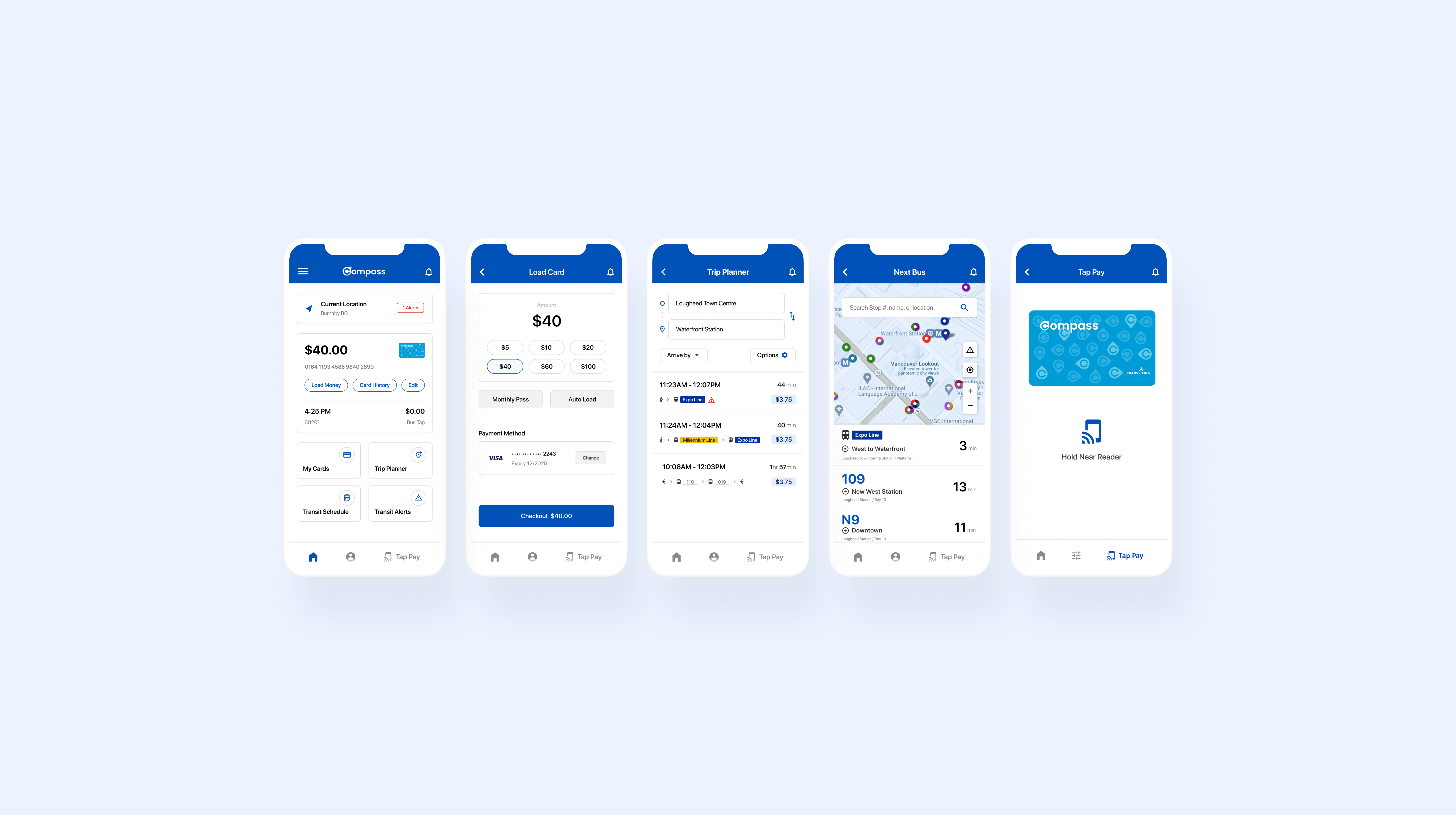
With the result of the user testing and the style guide, I finalized high-fidelity prototype. The final prototype shows a complete idea of how the Compass card app will look like in the final result.
Reflection
What I Learned
Takeaway 1
Since I was creating a new application for an existing service which the transit website is providing, I was initially inclined to reference the existing transit website too heavily for design decisions and solutions. However, I realized that the main goal of the project was not just to create a new product, but to create a better user experience through a new product and service.
Takeaway 2
During user testing, I also learned the value of providing users with room to discover the app's features on their own. By offering less direct test instructions, biases that could potentially skew the results would be minimized.

