Overview
Phorest is a fictional Vietnamese restaurant located in Vancouver that offers high-quality, reasonably priced dishes, making it accessible and enjoyable for all generations.
-
Role
Visual Designer
Front-end Developer
-
Duration
1.5 month
-
Tool
Adobe Illustrator
Adobe Photoshop
Figma
PROJECT GOAL
Creating an unique brand identity for the Vietnamese restaurant and incorporate brand message to visual design.
ANAYLZE
Defining
Target Audience
I defined the potential target user groups of the restaurant. Since the restaurant is targeting every generations. I created 3 different age group with different needs.

David, 25
University Student
Needs: Affordable price, convenience
Goals: To have quick healthy meal when get bored of fast-food and lazy to cook at home

Jamie, 34
Freelancer
Needs: Clean and aesthetic environment, good quality food
Goals: Being able to customize my order and provided friendly customer service.

Olivia, 40
Full-time employed
Needs: Family friendly restaurant, vegan and gluten-free options
Goals: To cut down unhealthy diet to keep family healthy
Core Brand
Concept
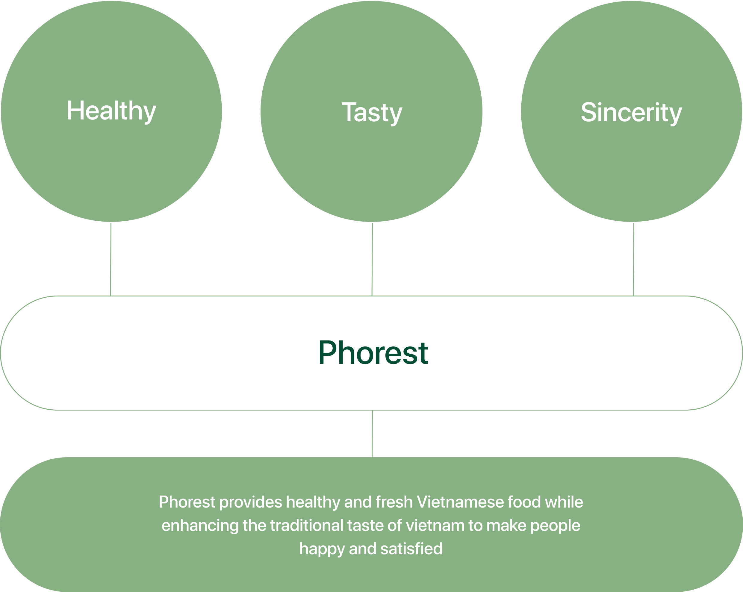
Based on the target users’ needs. I created the brand’s core values and mission with 3 main keywords. I came up with the restaurant name called Phorest It is a combined word with Pho and Rest. It has two meanings, one is providing a rest with the restaurant environment and another meaning is forest, which represents healthy and sincerity.
DESIGN
The Logo
I conducted research on various types of restaurant logos, and I decided to use an emblem logotype for my brand to achieve a blend of trendy and traditional aesthetics, as I had intended. I started by brainstorming logo ideas and creating multiple thumbnail sketches.
It Identifies
The logo was designed with inspiration drawn from three objects: a tree symbolizing health and sincerity, rice noodles representing Pho, and chopsticks representing Asian culture.

Usage On
Background
It is preferred to use the full-color logo only on white, brown, black backgrounds.When the logo is sitting on the black or white area of the image, only then the full-color logo should be used on photographs.

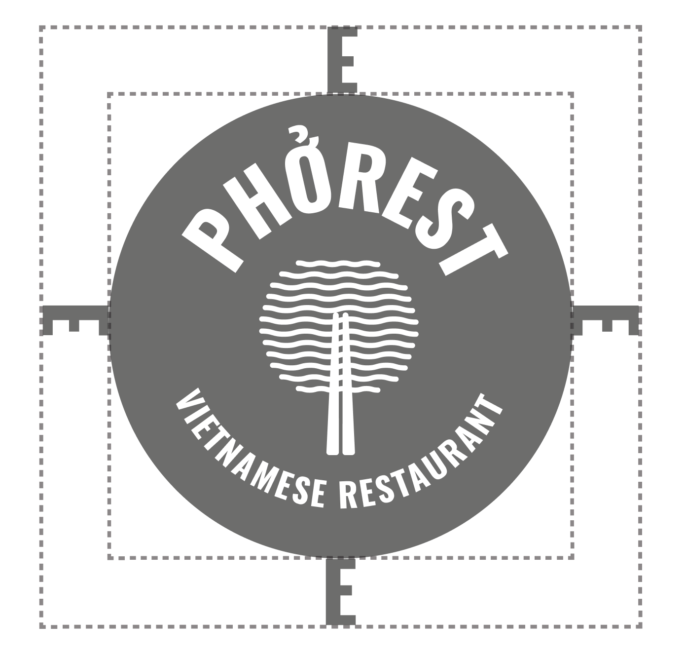
Safe Zone
To keep the feel clear, it is important to use a white background and to avoid overcrowding around the logo, maintain spacing around it.
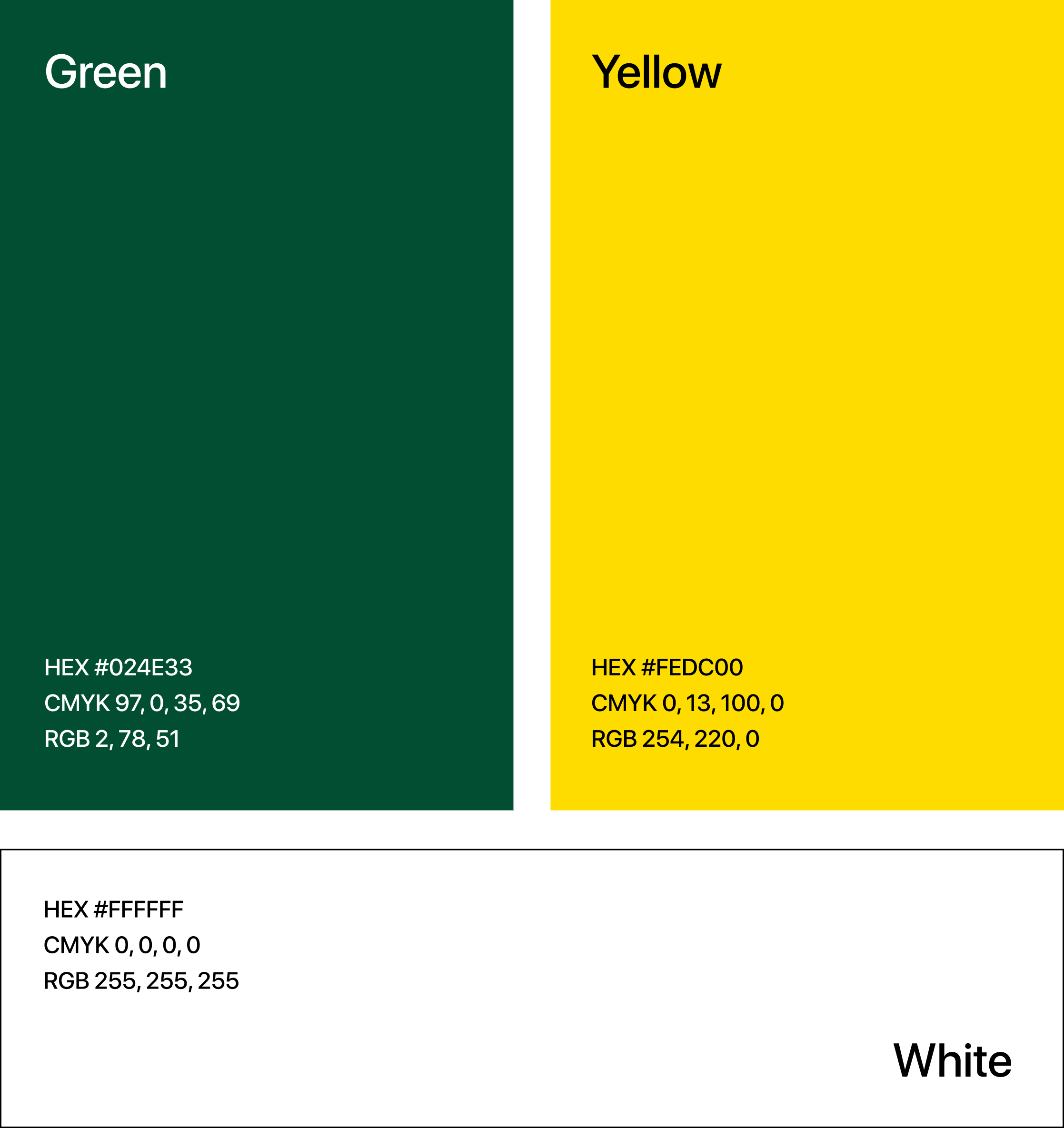
Core Colours
The colors used are inspired by the landscapes of Vietnam, with a combination of green and yellow that creates a traditional and warm vibe.
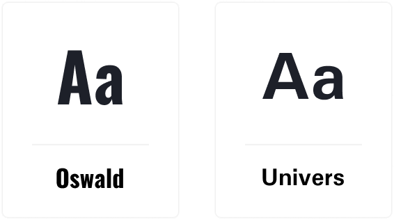
Typography
To achieve a blend of traditional and modern aesthetics in the emblem logo, I chose sans-serif fonts. I specifically chose Oswald font for the logo, as it imparts a clean and contemporary look, while also maintaining legibility. For the brand identity, I selected Univers as the secondary font, further enhancing the modern and clean aesthetic that I wanted to convey.
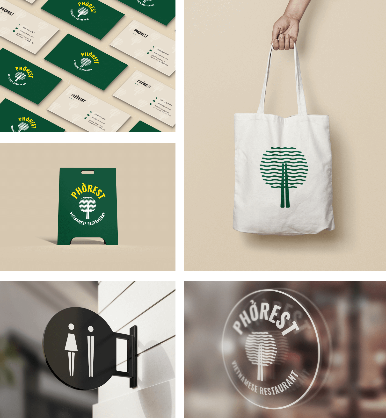
Implementation
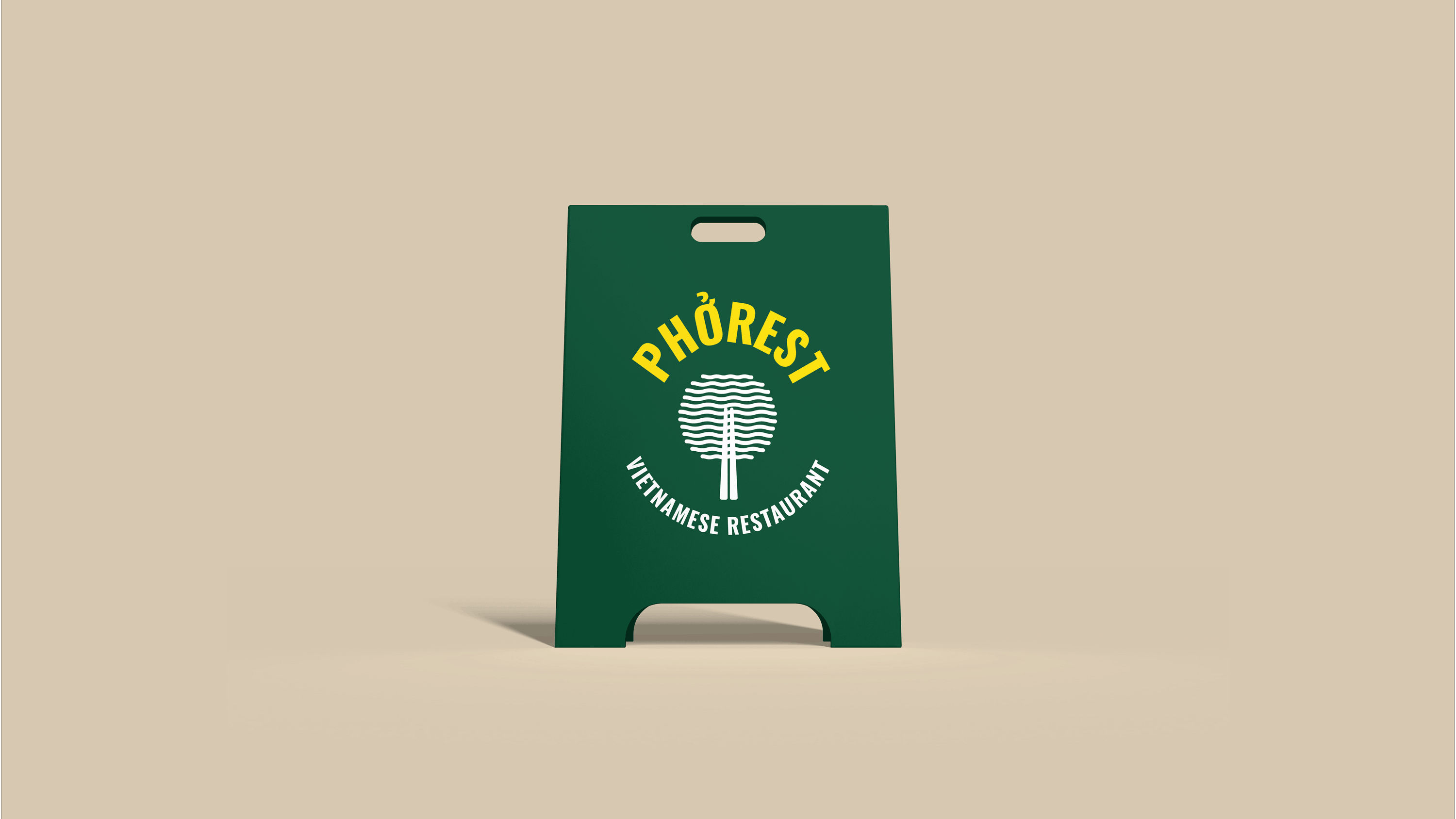
To complete the brand identity, I created stationery, restaurant goods, signage, and A-frame designs that adhere to the established visual language and reinforce the brand's image.
FRONT-END
Responsive
Web Design &
Development
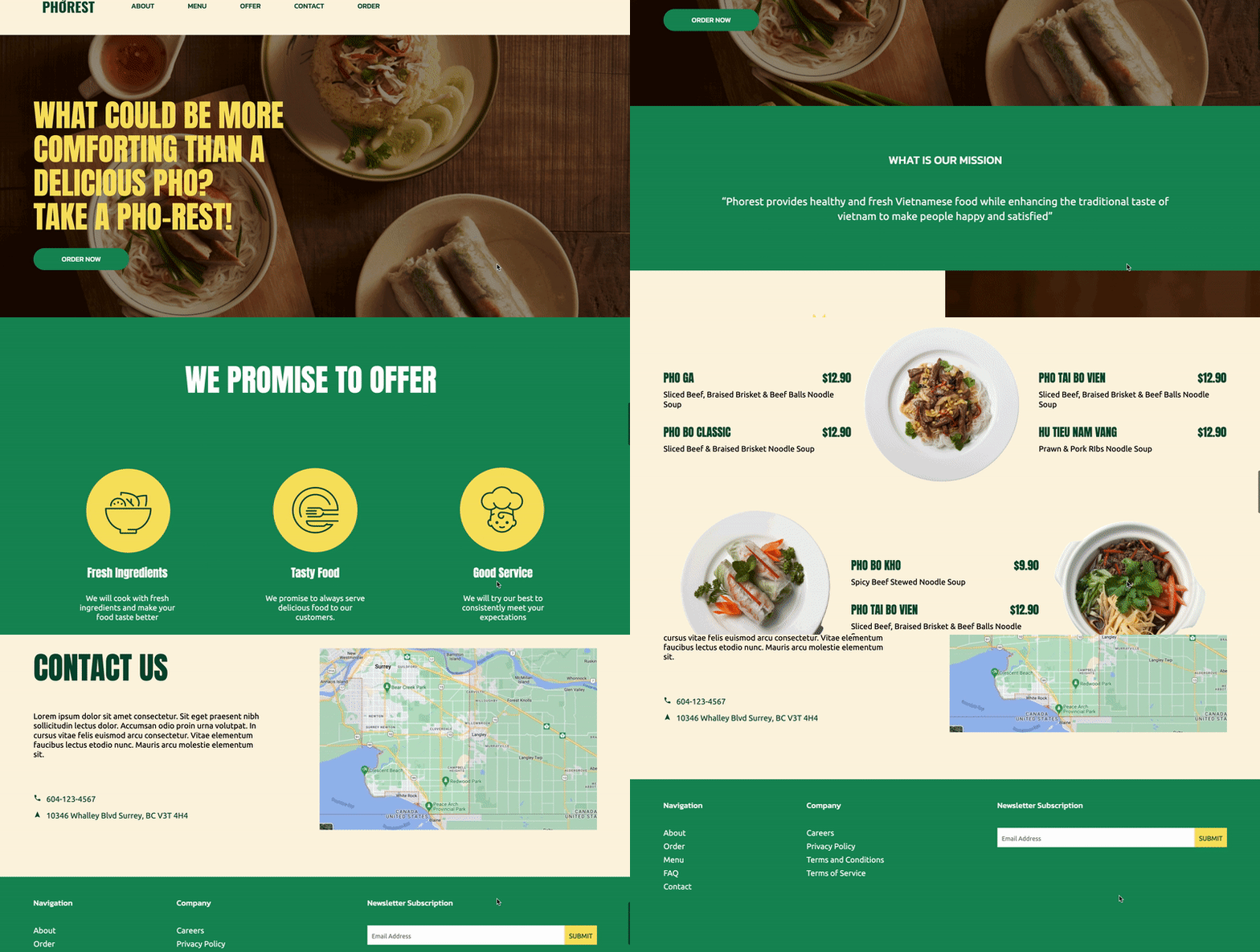
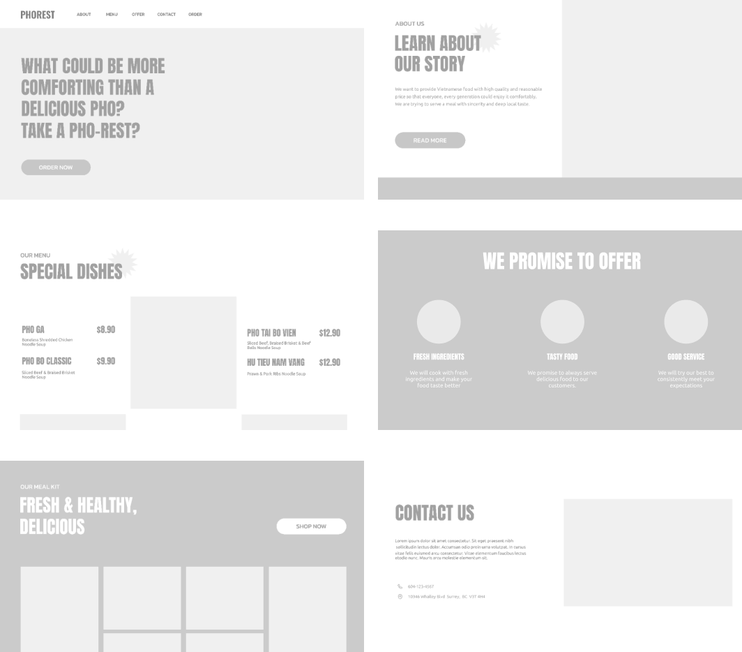
In addition to the brand identity project, I took the initiative to develop a one-page website using hand-coded HTML and CSS. To create a website that aligns with the established brand visual language, I created a wireframe for 3 screen breakpoints(desktop, tablet, and mobile) and build design system for the website UI.
Grid System

Wireframe
FINAL DESIGN
Hi-Fidelity
Prototype &
Website
To get a better idea of how the final website would look and function, I created a hi-fidelity prototype. This allowed me to visualize the design and layout in a more interactive and realistic manner. After finalizing the prototype, I proceeded to code the website, following the design and grid system. Using grid layouts has made it easier for me to create responsive designs and maintain consistency in my work.
